Figures
Four publication-quality figures from the May 2026 iteration of the pipeline, plus the legacy feature-importance plot. Each is committed to figures/ in this site so the page renders without requiring a re-run.
Figure 1 — National annual trend
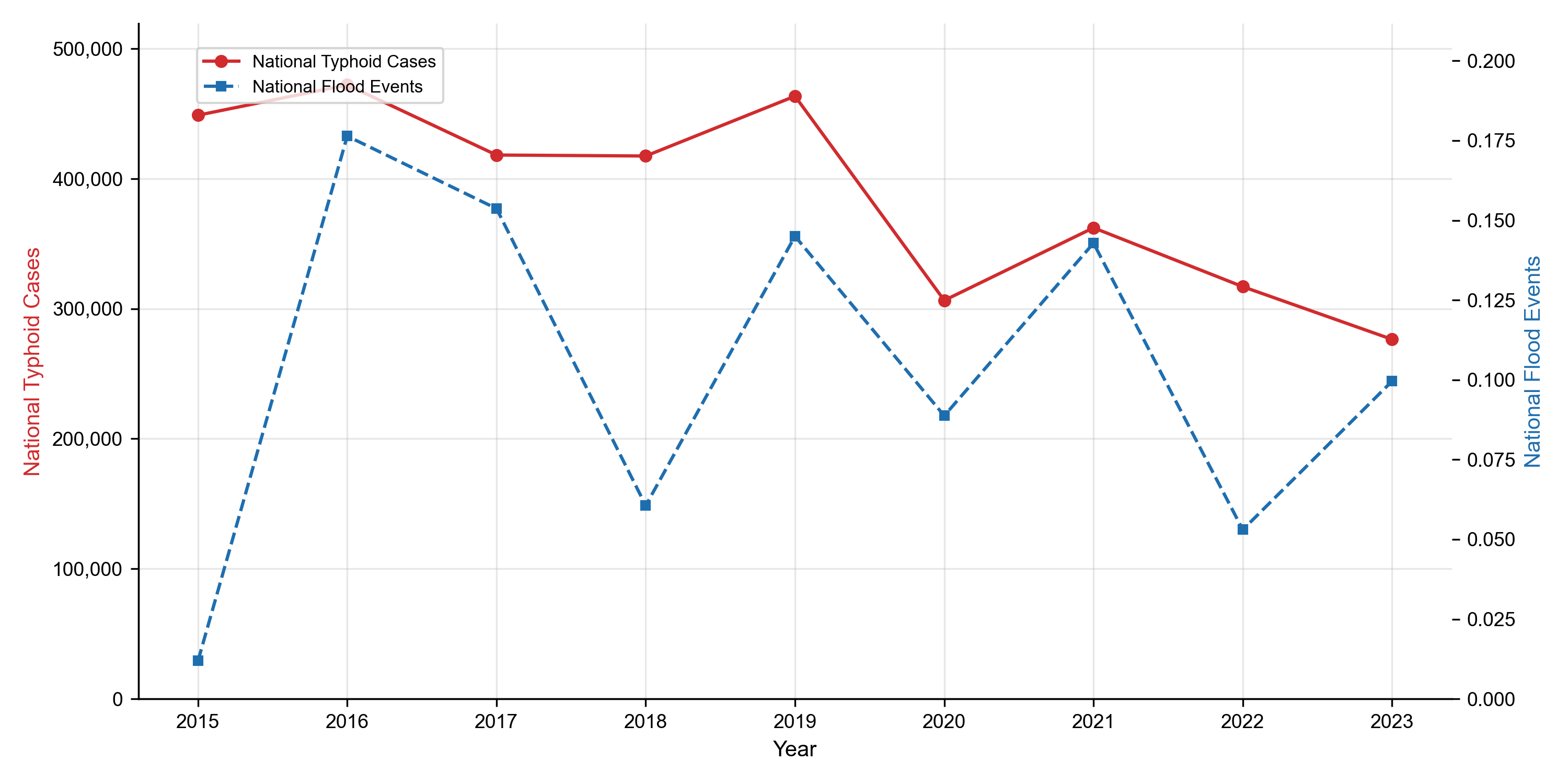
National annual typhoid case counts (HMIS, all 77 districts) plotted against the count of recorded flood events on a secondary axis. The strong 2015–2019 plateau and the 2020 dip — coincident with the COVID-19 lockdown reduction in outpatient attendance — are visible. The co-occurrence peak in 2016 motivates the climate × disease modelling that follows.
Figure 2 — Correlation heatmap
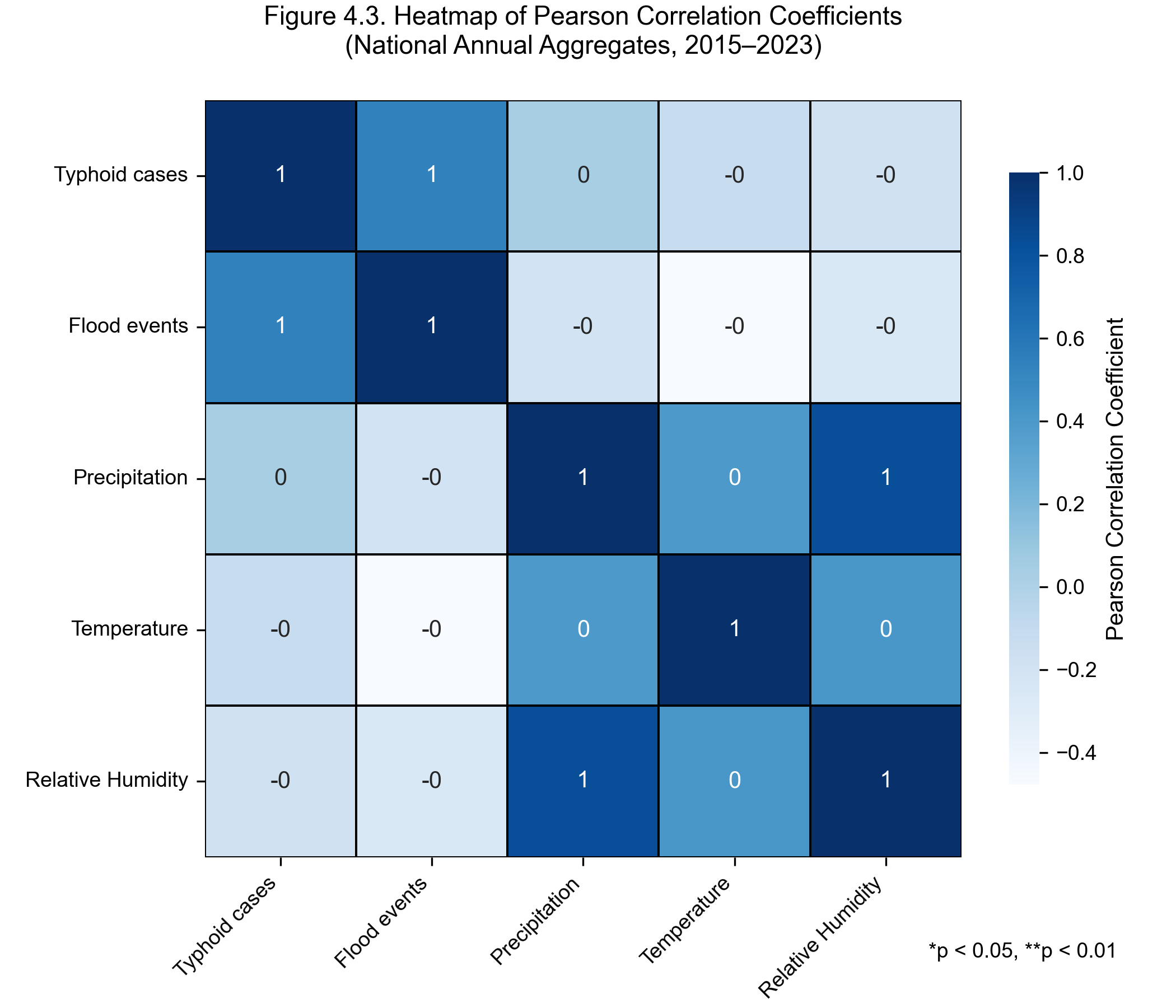
Pearson correlations among typhoid cases, flood events, precipitation, temperature, and relative humidity at the national-annual level. The diagonal-dominant pattern reflects the small sample size at this aggregation (n = 9 years); the model-relevant correlations are at the district-month level — see the Results §4.2 table.
Figure 3 — Feature importance (XGBoost) — legacy
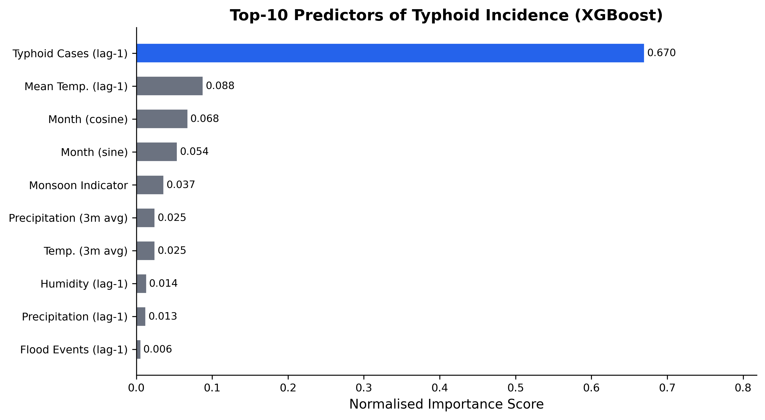
cases_lag1 dominate.
Gain-based feature importance from the previous XGBoost training run. Retained on this page because the shape of the ranking — lagged climate + autoregressive cases dominating — has been stable across iterations, even though absolute R² has improved substantially.
Figure 4 — Model performance comparison
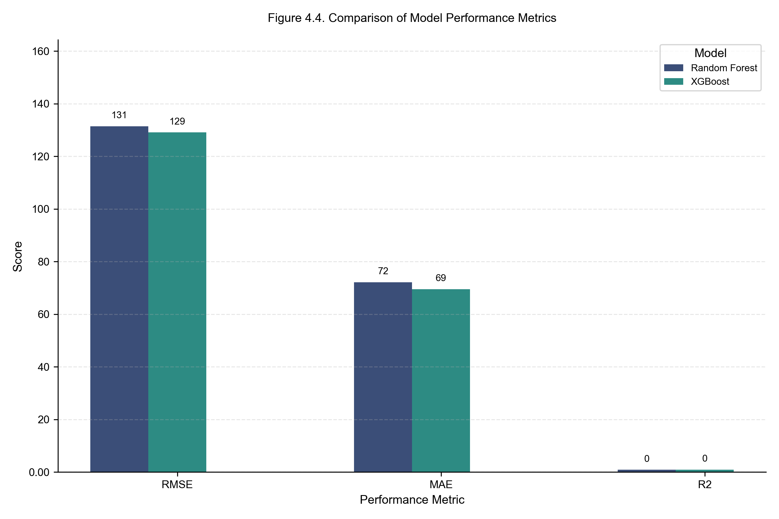
Side-by-side comparison of RMSE, MAE, and R² for the three individual trained models on the strictly chronological held-out test window (most recent 12 months). The three architectures cluster within 0.01 R² of each other (0.856 – 0.864); the Weighted Ensemble (not shown in this figure — it is a paper-style 3-model comparison) combines them to R² = 0.8675, RMSE = 126.20. The tight clustering confirms that the climate × autoregressive signal — not the choice of model family — sets the predictive ceiling. XGBoost is the operational pick when only one model can be deployed.
Figure 5 — Ecological-zone distribution
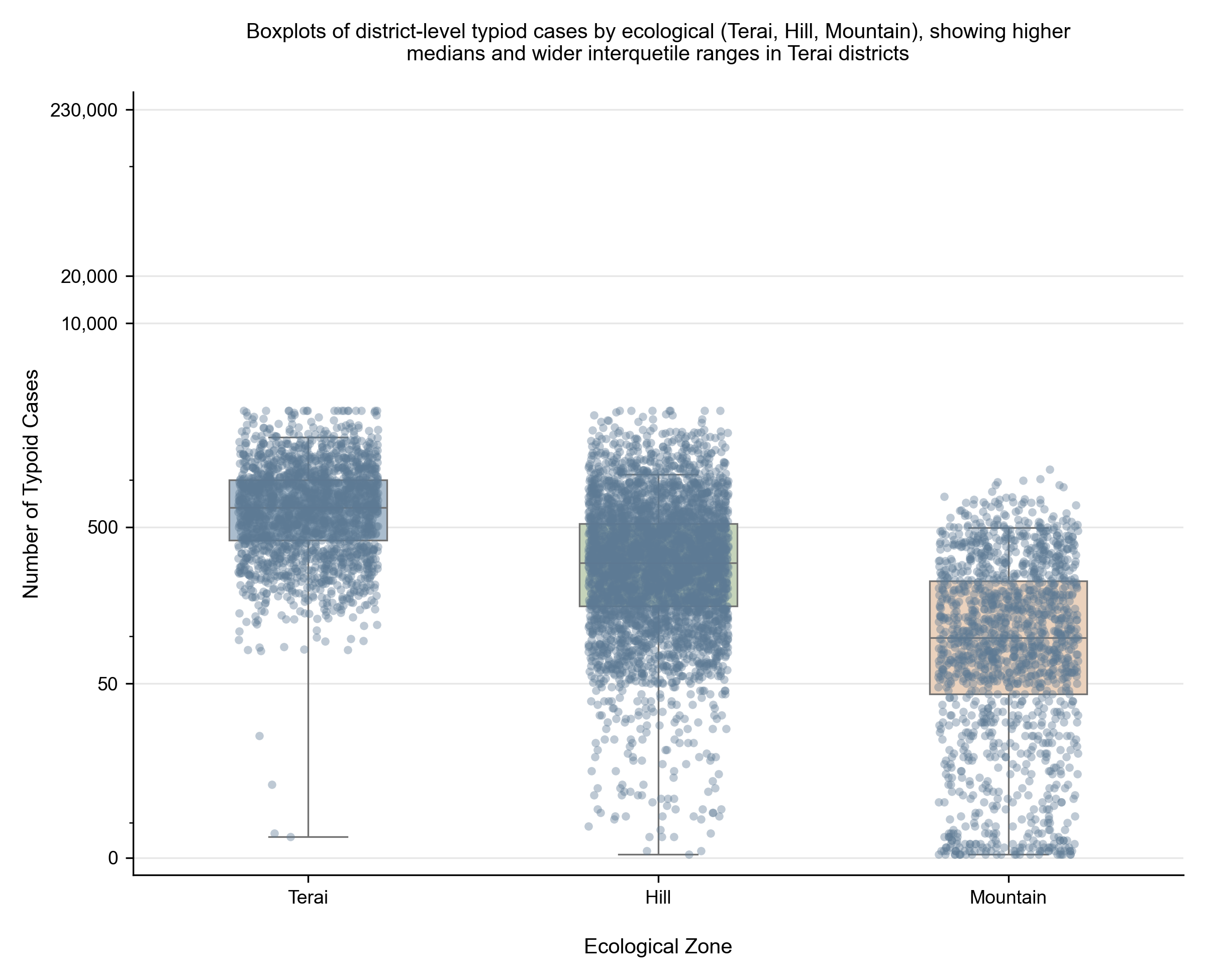
Boxplots of district-monthly typhoid case counts by ecological zone, pooled across 2015–2023. Terai districts show the highest medians and the widest interquartile ranges — consistent with greater flood exposure, denser population, and structural WASH deficits — while Mountain districts cluster at the low end. The symmetric log-scaled y-axis preserves the visibility of both the long right tail (~230,000 case-month outliers) and the bulk of the distribution.